Simulating mobile devices in Chrome

Software Engineering Team Lead and Director of Cloudsure
Edited on Friday, 27 August 2021.
Discover the simulation power behind the Device Mode feature in Google Chrome.
Chrome DevTools has a feature called Device Mode since Chrome 49. This feature extends some previous features by allowing you to simulate different devices and capabilities. Possible use cases include:
- Visual aid for designing a mobile-first and / or responsive web site
- Verify your implementation after you have implemented a design given to you by a front-end developer or agency
- Verify device, browser or OS specific features implemented on a web page
- Mimic browsing from a specific location
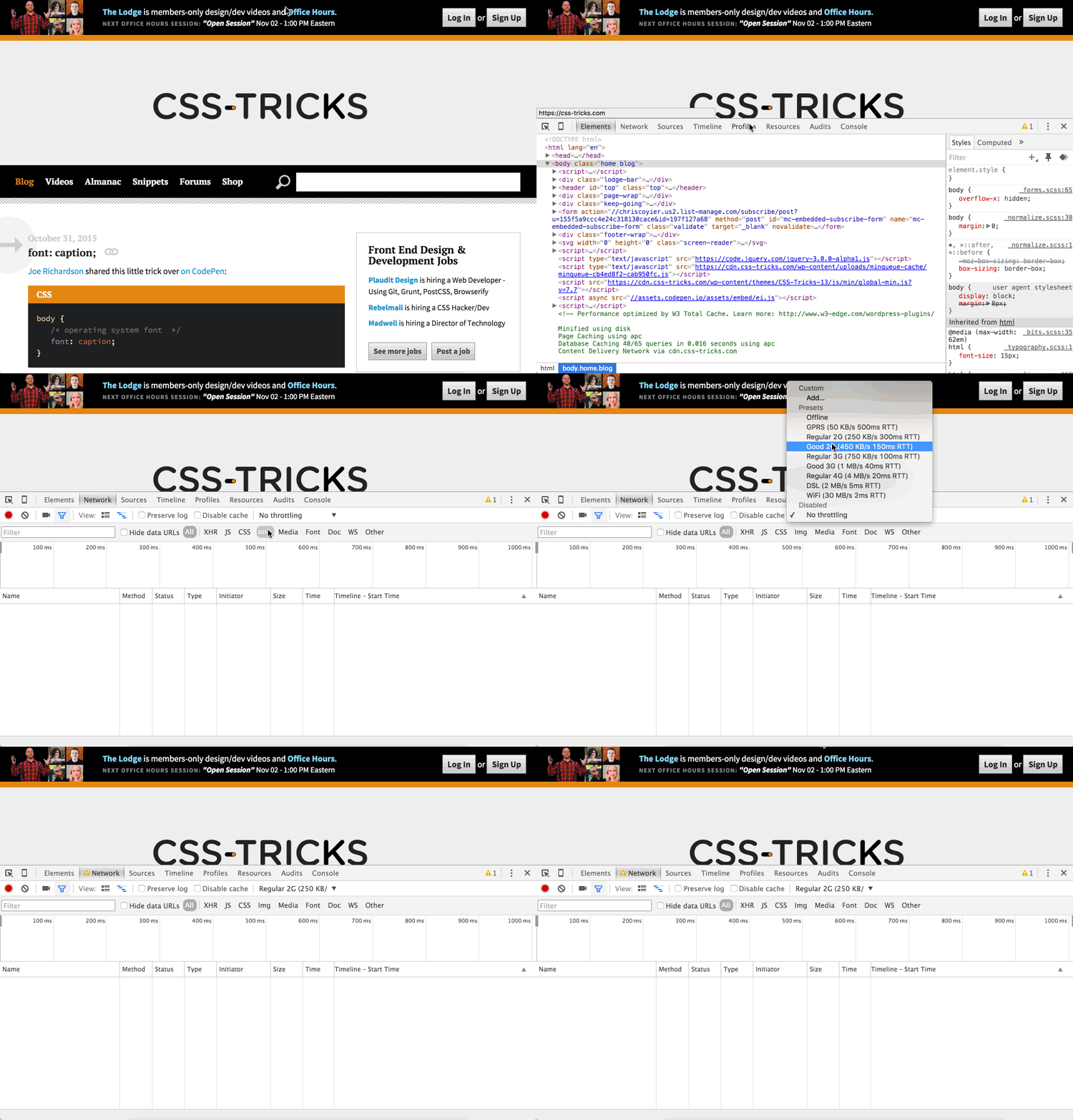
- Mimic different network conditions
Disclaimer: This tool will only simulate the display of a web page rendered by your version of the Chrome browser, so don't assume it works as expected across all devices and browsers. It can't emulate the performance characteristics of a real device. There are tools and services that can be used to achieve this but is beyond the scope of this topic.
Getting started
-
-
Open the Developer Tools window.
-
Open the Chrome menu at the top-right of your browser window, then select More tools > Developer tools.
- Windows:
F12orCtrl+Shift+I - Mac:
Cmd+Opt+I
- Windows:
-
-
-
Enable the Device Mode feature.
-
Click on the Device Mode icon at the top-left of the Developer Tools window.
-
You could use shortcuts, but make sure the focus is on the Developer Tools window and not the browser window for it to work.
- Windows:
Ctrl+Shift+M - Mac:
Cmd+Shift+M

Toggle Device Toolbar
You can disable Device Mode by clicking on the icon or using the same shortcuts as above.
- Windows:
-
Viewport controls
These controls give you the ability to test your web page across a variety of devices or directly interact with the responsive nature of it. You can change the device, width, height, zoom and orientation (if height is present).
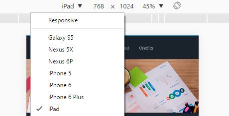
iPad device selected through the Viewport controls
Configure devices
Click on that drop down > Edit to add a custom device. Your will input a device name - used to display in the drop down options, viewport width and height, device pixel ratio, user agent string, device type, and, if you want, additional user agent client hints (websites render different content depending on the type of device it interprets based off these hints).
You can get a comprehensive list from User Agent String.com.
DPR, or Device Pixel Ratio, is the number of pixels on the screen that it takes to draw a single pixel used by CSS. The more screen pixels used, the sharper the image. You should be able to distinguish the difference between standard, HiDPI and Retina displays.
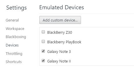
Selected Galaxy Note 3 and Galaxy Note II in emulated devices to add them to the list of devices
Media queries
You can use the media query inspector by clicking on Show media queries in the vertical three dot menu at the top-right corner of the Viewport controls.
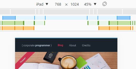
Media queries inspector on iPad display
The media queries for the web page are detected and displayed as colored bars. When you right-click on a color, you can reveal the CSS in the source code.
Example:
@media only screen and (max-width: 960px)
Example:
@media (min-width: 768px) and (max-width:960px)
Example:
@media (min-width: 768px)
Tip: If you are inspecting minified CSS (or JavaScript), you will notice a curly brace icon { } at the bottom of the view pane next to the line number. Click on this to format the source code for easier reading.
Responsive
Responsive mode gives you the freedom to move the viewport left to right, up and down, and diagonally. The width and height can be explicitly set at the top to the right of the device drop down list.
Network throttling
YThere are features that you can leverage in the Network tab to emulate different networking conditions.
- Cache: this feature only works while the DevTools are open. Cached resources will explicitly be fetched from the server when this option is disabled.
- Throttling: lets you hop onto a different type of network that is emulated by the DevTools. Options like fast and slow 3G exist. You can choose to go offline and you can add your own presets which require latency, download and upload speed.
- Network conditions:: opens up a new slit tab. Additional options include custom user agents and the ability to change accepted content-encodings like deflate, gzip and br.
For out more about optimizing performance under varying network conditions.
Additional options
Click on the kebab menu item to the top right of the bar and get more options which include:
- Device frame: toggles the frame of a cellphone around your viewport.
- Media queries: toggles the display of the media query breakpoints bar above the viewport.
- Rules: toggles pixel rulers displayed on the viewport.
- DPR: toggles the display of the DPR options on the top bar.
- Device type: toggles the display of the device type option on the top bar.
- Screenshots: takes a screenshot of the page or a full screenshot.
Sensors
When developing on a desktop you are at a disadvantage as there isn't native support hardware for GPS and accelerometers.
Chrome DevTools has a Sensors Emulation feature which allows you to override geolocation coordinates and device orientation accelerometer data.
Click on the vertical three dot menu at the top-right corner of the Developer Tools window > More tools > Sensors.
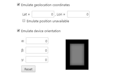
Enabled emulate geolocation coordinates and device orientation selected in sensors tab with default data
Find out more about emulating sensors.


